One Site to Rule Them All: Embracing Mobile Responsive Website and Application Design

There was a time when building a website meant first defining your canvas. What did the latest browser stats tell you about your visitors. Were low resolution monitors being sufficiently crowded out by those wiley, seductive widescreen monitors? In the bad old days, we would make the decision—usually arbitrarily as the web browser stats are so wide ranging— we’ll make it a static 960 pixels wide. That’ll fit nicely onto those old folks’ monitors still running at a 1024×768 resolution AND leave a few pixels to spare. We wouldn’t to crowd the edges too terribly much.
But we’re shifting into a new generation of web development. The trend actually started several years ago. As the smartphone and tablets became more and more ubiquitous, developers began looking for ways to deliver better experiences for mobile devices. For a while these took the shape of detecting a mobile device and sending them to another website that was stripped down, removing much of the website’s functionality and aesthetic appeal. It usually wasn’t pretty, but it did the job. It allowed mobile users to access information with ease.
Enter Mobile Responsive Design…
Then web browsers caught up. Several years ago, most modern web browsers reached a level of technological consistency that allowed for developers to build one website, with one set of content and show it to virtually any sized device and simple change the way the content is presented, simply by specifying specific style sheets.
It sounds simple. Almost too simple. And for all intents and purposes, it is. Mobile responsive design simply looks at the various common device sizes and says, “OK, you’re a smartphone. I’m going to go ahead make this block of text narrower, remove this thing that will just mess things up if we leave it in place and we’ll take this thing and center it and make it a little bit wider so that it all looks nicer for you.” The best is: it’s all handled by the web browser. And unless you manually adjust your screen width or orientation, you’ll never know.

Example: Mashable automatically changes their style sheets to provide a smooth user experience, no matter what device you’re on…
Building Responsive Websites and Applications…
Since mobile responsive design really took hold, there have been numerous frameworks that have been developed that make creating a mobile responsive website quick and easy to develop. The larger and most popular frameworks are designed with many common user interface elements built-in, requiring a developer to overlay their own custom styling to fit the custom design. Most frameworks also come with out of the box with functionality to ensure the vast majority of functionality works on older web browsers, so that your uncle running windows 98 can still see your brand new website, ALMOST how you intended it.
Popular Frameworks…
Bootstrap and Foundation are the two most popular frameworks, but there are many others. Here’s a short list of mobile responsive frameworks:
- Bootstrap — Built by Twitter, you’ll recognize the layout and design as it powers thousands (millions?) of websites. Most people just choose not to change too much of the top-level styling, but the options for customization are literally boundless. Bootstrap comes with dozens of Javascript components and a very large set of interface elements to literally bootstrap your website with minimal development time.
- Foundation — Similar to Bootstrap, but it’s developed to be more of a…foundation. It’s made to be built upon by developers, so it doesn’t come with as many built-in components as Bootstrap.
- Skeleton — One of the original boilerplate mobile-responsive frameworks. It’s much smaller in scope than most, but that’s one aspect that makes it popular with developers, depending on the type of project being built.
- HTML5 Boilerplate – Less of a framework and more of a template that allows you to create pages that work across devices. It’s used extensively across the internet.
- Gumby Framework
- Less Framework
There are dozens of frameworks as well as simplified templates that can get you setup with a basic structure that will allow you to easily and quickly develop mobile-responsive websites and applications. Choosing the right framework will depending greatly from project to project. Some frameworks come with a large amount of interface elements and components, while others are really just basic layouts and grids used to build a site from the ground up. It all depends on finding the right tool for the job.
Making the Switch…
At this point there’s no good reason to NOT develop your new website to be mobile responsive. The ease at which you can migrating your existing site depends on a number of factors, including the size and scope, as well as what CMS or templating system you’re using. Some websites can actually be made minimally responsive with a relatively low amount of effort. Some websites will require a complete rebuild.
But it’s important to keep in mind the speed at which mobile devices are growing in popularity:
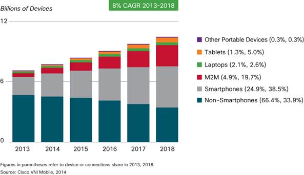
“We see a rapid decline in the share of nonsmartphones from more than 66 percent in 2013 (4.7 billion) to less than 34 percent by 2018 (3.5 billion).” — CISCO
These growth trends mean that adapting to the trend in the near-term is increasingly important. Not having a mobile-friendly site means forgoing potential sales due to customer frustration. Having a native, natural experience is now the norm.
Thinking about developing a new website or application? Find out how Tech Guys can help you create a mobile responsive website or application here »